Carousel
A slideshow-style container for cycling through a set of items.
bunx shadcn@latest add @nx-ui/carouselBasic usage
Intake sites cycle through the viewport, one at a time, with previous/next controls.
12,400t
processed this quarter
8,150t
processed this quarter
15,900t
processed this quarter
6,320t
processed this quarter
9,780t
processed this quarter
Multiple items per view
Pass Embla options via `opts` and size each item to show several slides at once.
12,400t
8,150t
15,900t
6,320t
9,780t
Image carousel
A full-width photo per slide with the arrows moved inside the viewport and dot indicators wired to the carousel context.







Image gallery with captions
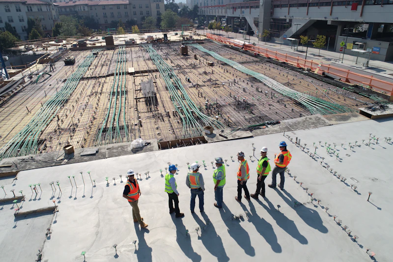
Sized-down items leave a partial next-slide peek, and each figure carries a caption — spacing comes from the default item gutter.




Vertical orientation
Set orientation to vertical for a stacked, scroll-up/down reading of a fixed-height panel.
Single slide
With only one item there is nowhere to scroll, so both controls fall back to their disabled state automatically.
Only one intake site reporting this cycle.
Composition: project tracker with slide counter
Reading the Embla API via `setApi` drives a live 'x of y' counter alongside the deck, for a realistic project-review composition.
Slide 0 of 0
API reference
Exported parts and their props, extracted from the component source.